Research paper
Frederik Berlaen
TypeMedia, KABK the hague, ’05’06
Thanks to Johan Berlaen for the ‘bezier-maker’, Erik van Blokland, Just van Rossum and Tal Leming for robofab, .ufo and vanilla
Elisabeth Demeyere for being in The Hague
The question
Is it possible to generate a pointed pen drawing?
In the first part of the postgraduate Type]Media I got in touch with DrawBot and scripting in the classes of Just van Rossum. DrawBot is an educational tool learning students how to script. I started to play around with the python program language. This was my first attempt to try to generate a pointed pen.
After New Year a very early version was ready and Erik van Blokland asked me to present it on the RoboThon scripting conference. This I did, with several enthusiastic comments afterwards. My eagerness for this research only increased by this event.
After this, my final question became more generalized: can a program simulate a pen? Can a program keep calligraphic style elements? I rebuilt the script from the first part of the course with more dept, with a stronger idea that is closer related to the qualities of a real pen. I had a closer look at the broad nib pen, the pointed pen and the relationship between them. This I tried to implement in a program that actually generates contrasts for these two pens.
Process of calligraphy
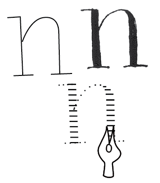
My purpose was to create a tool that behaves as a pen, so I first analyzed the process of writing with a pen.
Pen
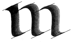
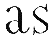
You start with choosing your pen. On your desk there is a collection of different kind of pens, from a small broad nib to a very wide one, and different kind of pointed pens, one more flexible than the other. From these you choose one. The broad nib is a flat, non flexible pen where the angle in most cases stays the same. For the roman construction the most common angle is around 30°. There are exceptions for the ‘s’ and the diagonals ‘k’, ‘v’, ‘w’, ‘x’, ‘y’, ‘z’ where the pen rotates to 45°. The angle for the cursive construction is around 45°. The capitals have again a 30° basis angle. The same applies to the diagonals: the pen angle is 45° and some capitals like the ‘N’ or ‘M’ need a rotation up to 60°. These rotations of the pen influence the proportion and they construct the contrast of a character. The angle of the pen determines the thick and the thin parts. Next to the contrast, the angle of the pen is also responsible for little details, little changes in a shape, because the pen can rotate for a whole contour and also inside that contour. For example to make small serifs, stroke endings, the top part of an ‘a’ can start around 45° and goes slowly to 30°.
The same principle can be applied for the pointed pen. The rotation of the pen is here even more important because the pen needs to rotate constantly. An other quality of the pointed pen is that you need to give some pressure to draw thick lines. The thin lines are drawn without any pressure. The contrast of a pointed pen is in direct relation with the angle of the pen and with the pressure, which complicates drawing certain characters. Then you need to rotate the pen. In most cases the angle of the pen is 90° and the pressure starts only in the vertical strokes. It is necessary to rotate the pen a lot, because it is only possible to make thick strokes when pressure is given on the pen. This is again only possible when the pen is pointed in the same direction of the stroke you want to draw. The contrast type is called expansion because the thin part grows into the tick part and vice versa.
Skeleton
In a drawer of your desk are different sorts of paper. You also choose one of them. In the end, you make a choice in the kind of ink or paint you wish to apply. Then the part starts where you are thinking about what the characters should look like. This is strongly related to the choice of pen, paper and ink. The movement of the hand is the most important part of calligraphy. This movement exists out of strokes. For example the ‘o’ is made out of two strokes. The first stroke goes from the top and turns left in a bowl to the bottom. The second stroke starts again at the top and turns right to the bottom. The hand must be raised to go to the top again for the second stroke, because the pen does not allow making upstrokes. It causes friction with the paper. The cursive construction is build out of upstrokes. Because there is less friction, upstrokes are possible. The collection of all these strokes construct the skeleton. This imaginary path forms the skeleton of that character. The pen and the angle of that pen define the contrast. If the pen is a pointed pen, the pressure on the pen also determines the contrast and the drawing. This movement is a skill that can be learned by practice. Penmanship is developed through repetition, reproducing and patience. The quality of it depends on the skill of the writing master. Penmanship is all about beauty, repetition and drill.
I chose the broad nib and pointed pen because they are common used and these pens cover the most of the traditional writing systems.
The reversed process
My idea was to simulate, to generate a pen. The process of the kalliculator is based on the process of calligraphy, but then reversed. First the skeleton must be drawn, which is the movement of the hand, and then you choose the kind of ‘pen’ and apply it on a ‘paper’. The ‘pen’ became digital and the ‘paper’ the output, which can be a .pdf or a font. I reversed the process for scripting reasons. There has to be a shape in your head first, in order to apply a pen on it afterwards.
The skeleton
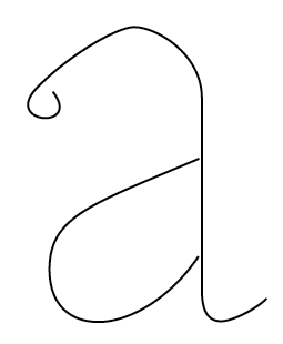
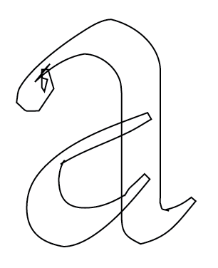
In calligraphy the skeleton is the movement of the hand when writing a character. It can also be seen as the middle of a stroke. However, the exact mathematical middle is not equal to the movement of the hand of that stroke. A skeleton is something in between. A pen in a hand turns around and the mathematical middle does not take these rotations into account.
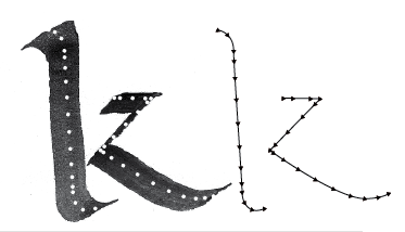
A skeleton is a collection of strokes. The difference with strokes is that a skeleton can be simplified into one line. For example an ‘o’ is made out of two pen strokes, but the skeleton consists of one line. In the digital movement, the skeleton, you don’t lift your hand anymore, only when the stroke starts somewhere else. This is for example the case with a ‘d’, it exists out of three pen strokes but only two contours. Thinking in strokes has become redundant.
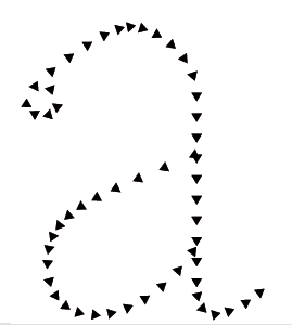
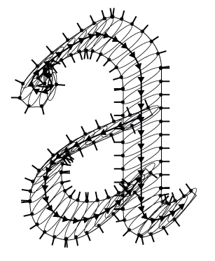
The skeleton of a character, a glyph, is built up out of curves and beziers. One curve is controlled by a starting point, two handles and an ending point. The two handles control the curve, where it is bending to. These curves cannot contain any information of a pen inside. I had to find a way to store the skeleton and all the information about the different pens. This is the start of a .pfo, which is a Point Font Object. A .pfo does not have any curve inside but is made out of points which were on a bezier. It is a long list of points. Each point can be compared with a touch of the pen on the paper. During one stroke of the pen, the pen touches the paper a hundred times. At the end it looks fluidly, provided there are enough points. This resolution can be interpreted as the speed of writing. When writing very slowly, which is translated into more points in a .pfo, the precision is higher. The higher the speed of writing, the lower the precision of the drawing. I translated this in a resolution parameter. The end result will have more fluid curves if the resolution is higher.
Each point contains information about the broad nib pen and the pointed pen, necessary to draw the glyph afterwards. It contains the parameters that determine how the pen must be handled, for example the angles of these pens.
The pen
How to automate the pen? There is a contradiction: automating a craft. Can a craft be generic? In the pure sense it cannot, because a craft is an activity involving skill in making things by hand. But still there must be a way to automate a big part of that skill. The most important stage in attempting to generate a craft is to describe what you want to automate. In this case it is the pen, the pointed and broad nib pen.
What is a broad nib pen
A broad nib pen has a certain width. The nib is not flexible. In most cases the pen is being held in a 30° angle. This angle forms the contrast because the hand follows the skeleton, while the pen is always in the same angle. Differently put; the width of the pen always stays the same. While drawing the shape, your hand turns around following the skeleton, holding the pen in a certain angle and that pen draws a thin line on each point. This is the scripting translation for a broad nib pen.
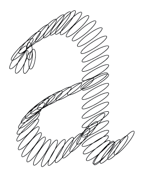
Here it is possible to add a certain thickness to the pen. Now on each point of the skeleton, the digital ‘pen’ draws a little rectangle or oval. The result of drawing an oval is nicer because it results in a more smoothly formed shape. A rectangle is too square.
For the broad nib pen, two parameters determine the look of the letter. Firstly, the shape of the pen is determinative; the wideness and the thickness, is it an oval or a rectangle. The second parameter is the angle of the pen. The angle can be set for each contour, each segment even for each point on the skeleton. It is important to be able to set a different angle for each point because in some situations the pen rotates a bit inside a segment or a contour. These settings create the opportunity to generate more detailed characters so that the end result is closer to the calligraphic starting idea of my tool.
What is a pointed pen
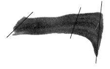
A pointed pen is a flexible pen. The thick parts in a shape are created by pressure on the pen. The two legs of the nib open when giving pressure on the pen and the ink can flow widely. When there is no pressure, the lines are thin.
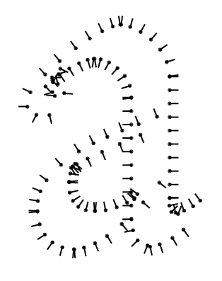
In most cases the thick lines are in the vertical part of a character and the thin parts are horizontal. For the pointed pen, four parameters define the digital drawings. The first parameter is again the shape of the pen; is it an oval or a rectangle? How wide can the thickest part be? How thin must the thinnest part be? The second parameter is also the same as for the broad nib pen: the angle. If the contrast only has to be in the vertical part of the character, the angle of the pen is 90°. If you want an inverted contrast, the angle of the pen is 0°. This angle is the same angle of the pen when writing with it. The third parameter is the pressure given on the pen. The pressure determines the thickest part and also the point where the expansion starts to grow from thin into thick. Does the expansion have to start directly or more to the end of the segment or the contour? The fourth parameter is the skeleton angle. This angle determines where the contrast must be. Each point on the skeleton has an angle compared to the total skeleton. The combination of these four parameters defines the drawing of a digital pointed pen.
So what actually happens is that the digital pointed pen draws a thin line. The lines are perpendicular on the angle of the skeleton. The starting length of these lines is equal to the smallest value set of the pen. The length can grow to the thickest line set. The growing value is defined by the angle of the pen in relation to the angle of the skeleton and the pressure given upon it. This makes the pointed pen the most complex of the two pens. For me personally, the pointed pen is also in real writing the most difficult one because of all the parameters mentioned above. It is needed to give the right amount of pressure on the pen, in the right angle, to end up with a shape you pictured in your mind. The pointed pen asks a lot of practice and drawing skills.
What is the relation between these two pens
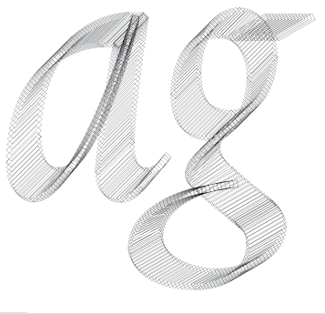
Because these two pens are now translated into para-meters and values, it is possible to interpolate, to inter-pen-ate between them. This makes it all very interesting because the result can be 20% broad nib and 80% pointed pen. These new contrasts are not possible to draw by hand because these pens do not exist.
The relationship is based on the parameters of these pens. The first two can interpolate because they share the same information: the shape of the pen (oval, rectangle and their dimensions) and the angle of the pen. The other two parameters of the pointed pen have a decisive influence (100%) when the pointed pen is selected. They have no influence on the broad nib pen.
This results in exciting possibilities. When there is a possibility to interpolate, it is also possible to extrapolate. Of course these results are not controllable and definitely not calligraphic. But they are a new sort of contrast, which offers new shapes to experiment with.
Type for print as pen research
Next to this scripting project, I also researched the difference between these two pens in a printed type version. What I did was designing a broad nib and a pointed pen version for print. I tried to implement my conclusions into my program.
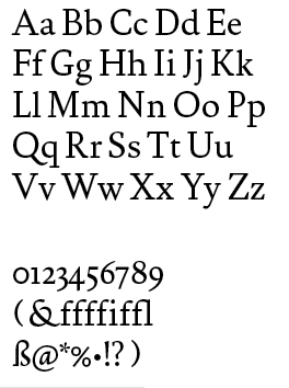
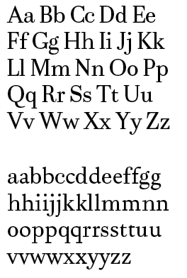
The starting point for drawing this type, used in this paper, was to design a true broad nib and pointed pen version. The only reason of existing for these typefaces is research. They do not solve any technical problem. They are not made to be used in a specific size, but I drew them with a text type in mind. I started with sketching and afterwards digitalized these drawings. The BroadNib Regular and PointedPen Regular have the most complete character set. I added black versions for both styles. The text in this booklet is set in BroadNib Regular, titles are set in the PointedPen Regular.
The first thing that struck me, is that the skeleton of these two types are very different. The general proportions of these two styles are different. When writing with a broad nib pen, there are no upstrokes possible, unlike writing with a pointed pen. This causes that all the connection parts, in a ‘n’, ‘b’, ‘r’, ‘d’, are deeper into the stem with a pointed pen.
In the round characters, the broad nib pen is rounder, and the pointed pen is more square. This is caused by the vertical contrast. If the pointed pen skeleton has the same roundness, it will look extended and have not enough black compared to the broad nib pen.
Because with the pointed pen the contrast is in general more vertical, it gives the type a more vertical look. The contrast also makes the counters bigger. This gives visual problems when the type is used next to each other. The pointed pen seems a bit bigger, even if they measure the same height of the characters. A solution to this problem is to lower the x-height in the pointed pen, or to increase the height in the broad nib. This value is put into the program. It scales the type a bit down for the pointed pen, only in the y-direction.
Another contrast issue is the width of the thickest parts in a glyph. Because there is a strong relationship between thick and thin in a pointed pen, there is less black in a glyph of the broad nib pen. The only reason for this is that the width of the pen is always the same in a broad nib pen. Again this is only causing difficulty when they are used next to each other. The problem is that the pointed pen looks too light. It is possible to make the global letter a little darker, but then you are losing contrast. I wanted to draw with the same ‘pen’-dimension as the broad nib and pointed pen. Another way to solve this problem is to raise the contrast by making the thick part of a glyph more thick. I found out that the tick parts of a pointed pen can be up to 10% more thick than the broad nib pen, in order to end up with the same blackness.
Finally, a difference is created when the weight is altered from regular to black. Most of these weight problems can be solved by adapting the skeleton or the angle of the pen, but it is recommended to adjust the skeleton. A black broad nib pen has a different skeleton from the regular weight, because it has a higher contrast. When creating a black based on the skeleton of a regular, the contrast remains at the correct spots, but the end result does not have the same sharpness. But when the weights are going to an extreme there is at a certain point to much black. In order to solve this problem with a qualitative outcome, the skeleton has to be changed.
At the end the program is given different skeletons, which are interpolations between skeletons. This can even be interpolations between skeletons from a broad nib pen and a pointed pen and their black versions. Imagine then an inter-pen-ation and the search for new contrast is open.
The output paper
With a pen you write on paper, with these digital pens it is possible to write in any possible digital format; on screen, in a .pdf, in a font.
The first action, and the fastest way to do so, is to define on each point of the skeleton the shape of the pen, oval or rectangle in the dimensions set for that pen. This result gives nice shades: a lot of overlapping ovals or rectangles. This gives the glyphs a third dimension; they are not flat any more.
This was actually not the result I was looking for. I wanted to have a clean outline. I came up with the idea to put every extreme of each oval or rectangle in a list. This list is the contour of a glyph. For a rectangle, this is quite easy because there are only four possible points for the extreme. For an oval, this is more complex. The extreme points of an oval depend on the angle of the point where the oval has been drawn on the skeleton. So the skeleton angle determines the extremes of an oval. There are only two points on an oval where the intersection with the skeleton angle has only one value. These two points are the extremes of that oval. This has to be calculated for every oval.
Followed, this list is put into a ‘bezier-maker’. This piece of code generates from a list of points nice beziers. The ‘bezier-maker’ is made especially for type design. It calculates the anchor points, only on the extremes of the curve. This implies that the handles, which control the curve, are not over 90°. The best way to generate beziers out of a list of points is to ensure that the angles of the handles are fixed. The script then only calculates the length of these handles until the error parameter is reached. This parameter ensures that the distance of a point in that list to the generated bezier is smaller than the error. When this distance is bigger than the error, the script runs again and again until the error parameter is reached. The output exists now out of nice bezier curves for on screen, .pdf and in a font.
Review
skeleton -- pfo -- ovalaatjes -- extremes -- linetos -- beziers/
Evaluation
I am very happy with the result now. It looks very calligraphic. Especially for the broad nib pen when the pen settings are close to what a pen is: flat. It works good because the digital pen is made from the idea of a real pen. If the pen has a thickness the output is less balanced. At this stage, an optical correction is not yet embedded into the program. There are still some problems to solve at the start and end of contours. When the pen applied is flat, this causes no problem.
For the pointed pen it is more difficult to set the correct angles, the right pressure, in such a way that the curves generated are fluid. The cause lies in the many parameters that control this pen. The pointed pen does not have this problem when the pen has a thickness like the broad nib. This is due to the qualities of the pointed pen and to the way the program interprets the parameters. The width of the pen is the same as the thickest parts and the thickness of the pen is equal to the thinnest part in a glyph. So when the pen is flat, the thinnest parts are very thin and the contrast is very high.
It is possible to export it to a font file, .pdf and see it on screen. It is very nice that it works to export the glyphs as beziers. The ‘bezier-maker’ is a very strong script. The input is a list of points and it returns as a list of beziers. I did not imagine I could get so far.
But the power of this tool lies in the skeleton based on calligraphy, and in the combination of the skeleton with the complexity of the digital pen. The skeleton is a flexible proportion definition. This means that the skeleton contains information about the proportion of a glyph. This can be transformed in any direction. Afterwards a pen applied is following these proportions. The pen can have any shape or dimensions. Because the pen is disconnected from the skeleton it can generate pen drawings from any skeleton, irrespective of how the skeleton is turning or bending, the pen will just follow this and calculate the contrast on the right spots.
This program is not generating ready made typefaces, but it is close. It is a tool to generate different contrasts from the same or from several skeletons. It can help type designers because the output has a correct contrast, which is set in the digital pen. It is an intermediate to research what happens when there is a higher, lower or inverted contrast, when the pen is wider or smaller, when the shape is something else.
What can be improved
There are some things I did not solve until now. When a contour end or starts, there are still some problems. Because I have to add a point in the contour list at the beginning or ending. It is in some cases difficult to make a choice which points has to be in the list because the pen turns and turns around a curved skeleton.
This unsolved problem causes a bigger problem because the list of points is then not in the right order any more. So I have to write a ‘clean-up-point-list’ script, which is also removing the overlap. These problems are visible in the return of the ‘bezier-maker’, the list of beziers.
I have to rebuild the whole program because there are some structural problems. If I want to add a new function to the program I have to change too many aspects to make it work. You can compare it to a small house. On that house I built new floors, terraces, removed rooms and made others rooms bigger. At a certain point it is better to demolish the whole building and to start over again with a bigger house as basis, where there is space foreseen to install later for example an elevator.
What is missing
A preview of a string of characters next to each other.
It has to able to work with multiple fonts at the same time and also to view them next to each other.
A skeleton editor to adjust the skeleton inside the program. It must also be able to load several skeletons and interpolate between them.
It should be possible to add tags to a glyph, a contour, a point and make a tag-editor where these tags can be changed. In a font, several glyphs have almost the same rounding, stems, serifs. If they can be tagged,it works faster to adjust the rounding, the stems, the serifs for the whole font.
Because the ‘bezier-maker’ works very well it must be possible not to start from a skeleton but from a scanned image. It can calculate the skeleton. An other side project with the same ‘bezier-maker’ is to develop an auto-tracer specially designed for typedesign.